
Have you ever walked into a study room and felt that something was off, even when the furniture was good and the room was clean?
Many people face this. The room may look fine, but it still feels dull, heavy or distracting. A child avoids sitting there. A working adult keeps getting restless. A quiet room somehow does not support quiet thinking.
This is where colour starts to matter.
In Vastu Shastra (वास्तु शास्त्र), the colour of a study room is not chosen only for looks. It is chosen to support calmness, clarity and steady focus. The right shade can make a room feel lighter and more settled. The wrong one can make it feel closed, harsh or tiring.
This matters not only for children preparing for exams, but also for adults using a home office, reading room or prayer-cum-study corner. For many homeowners, especially those planning a new home or updating one room at a time, colour is one of the easiest ways to improve the energy of a space without major structural changes.
Across leading décor and Vastu articles, a clear pattern appears. Light green, white, cream, pastel blue and pale yellow are the most commonly recommended colours for study spaces. These shades are usually preferred because they feel calm, balanced and easy on the eyes.
In this guide, we will look at the best Vastu colours for a study room, colour combinations that work well, colours to avoid, décor tips, tile ideas and simple remedies if your current room does not feel right.
Why Study Room Colour Matters In Vastu
In many Indian homes, the study room is not always a separate room. It may be a corner in the bedroom, a small upstairs room or a space next to the living area. That is exactly why colour becomes more important.
When space is limited, colour does a lot of the work. It can make a study area feel peaceful, organised and mentally clear.
Vastu connects colour with balance. The aim is not to make the room flashy. The aim is to make it supportive.
This idea is tied to the five elements, known as the Panch Mahabhuta (पंच महाभूत):
- Earth (Prithvi) (पृथ्वी)
- Fire (Agni) (अग्नि)
- Water (Jal) (जल)
- Air (Vayu) (वायु)
- Space (Akasha) (आकाश)
Each element carries a different quality. Earth supports stability. Water supports calmness. Air brings movement. Fire brings energy. Space creates openness.
A study room needs the right mix of these qualities. Too much heaviness can make the room dull. Too much intensity can make it hard to focus. That is why soft and balanced colours are usually preferred.
This also matches how people experience colour in real life. For example, many parents notice that a child studies more comfortably in a light room than in a dark one. A retired couple setting up a reading room may also feel that cream, light green or soft blue helps the room feel more restful.
Best Colours For A Study Room According To Vastu
There is no single colour that works for every home. The best choice depends on who uses the room, how much natural light it gets and whether the room is used for study, reading or office work.
Still, some colours are consistently recommended in Vastu-friendly interiors.
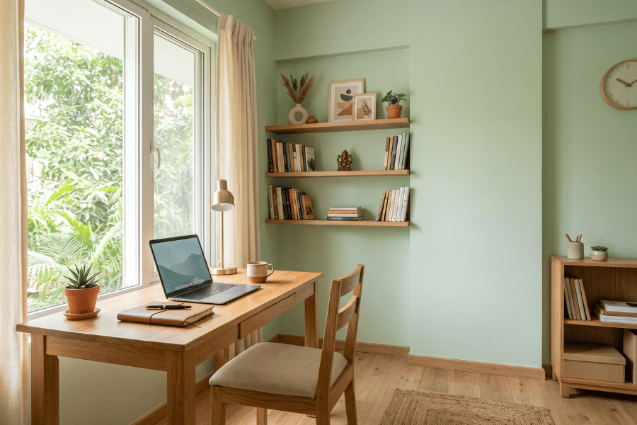
Green For Calm Focus
Green is one of the most trusted colours for a study room. It is associated with balance, growth and steady thinking.
Soft green works especially well in homes where the room is used for long hours. It feels restful and does not put pressure on the eyes. If your son is preparing for competitive exams, or if you use the room for reading bills, writing notes or doing office work after retirement, green can make the space feel settled.
Yellow For Learning And Alertness
Yellow is linked with brightness, learning and active thinking. A gentle yellow can lift the mood of a room and prevent it from feeling dull.
This works well in homes where the study space gets less sunlight. A pale yellow wall can make the room feel warmer and more positive. But keep it soft. Bright yellow on every wall can feel too sharp.
White For Clarity And Light
White is simple, but very effective. It helps a study room feel clean, open and mentally clear.
Many Indian homes have smaller study spaces. In such rooms, white can create a sense of openness. It also pairs easily with wooden furniture, light tiles and simple décor. If plain white feels too stark, choose off-white or ivory.
Cream And Beige For Warmth Without Heaviness
Cream and beige are good choices for homeowners who want a softer look than white. They create warmth, but still keep the room light. These shades work particularly well in homes owned by couples in their 50s or 60s who prefer quiet, timeless interiors over trendy colours.
Light Blue For Freshness And Steady Attention
Light blue is often recommended for calmness and concentration. It can work well in children’s study rooms, home offices and reading corners. It is also a good choice where the room feels visually warm or stuffy. A soft blue can bring freshness without making the room cold.
Which Colours Are Best And Which Should Be Avoided?
It is usually easier to choose well when you know what not to do. The best colours for a study room are usually light, simple and balanced. The worst choices are often too dark, too bright or too intense for long use.
Colours That Usually Work Well
| Colour | Why It Suits A Study Room |
|---|---|
| Light Green | Calm, balanced and easy on the eyes |
| Pale Yellow | Brightens the room and supports alertness |
| White | Creates clarity and openness |
| Cream | Soft, peaceful and welcoming |
| Pastel Blue | Fresh, calm and supportive of focus |
| Beige | Warm and grounded without feeling heavy |
Colours To Use Carefully Or Avoid
- Black on large walls
- Dark red across the whole room
- Neon shades
- Too many strong colours together
- Very dark brown in a small room
These colours can make a room feel closed, restless or mentally tiring.
Red is a good example. A little red in a chair, cushion or frame can add energy. Too much red on the walls can make the room feel tense.
| Colour | Why It Is Better Avoided |
|---|---|
| Black | Makes the room feel heavy and shut in |
| Dark Red | Can feel agitating if overused |
| Neon Shades | Distract the eye and break focus |
| Too Many Dark Tones | Reduce light and make the room dull |
How To Choose The Right Study Room Colour
Choosing the right colour is not only about Vastu rules. It is also about the room you actually have.
A north-facing room with less sunlight will feel different from an east-facing room with bright morning light. A shared study room will feel different from a quiet reading room.
When you first assess a room in Vastu, it also helps to understand all 16 zones, not only the basic eight directions. These 16 zones are: north, north-north-east, north-east, east-north-east, east, east-south-east, south-east, south-south-east, south, south-south-west, south-west, west-south-west, west, west-north-west, north-west and north-north-west.
This fuller view matters because Vastu does not treat every wall or corner in the same way. Even small shifts in placement can affect how colour, light and function come together.
Here are some practical ways to choose well:
- Use one main wall colour and one or two supporting tones
- Keep the room light if it is small
- Use bold colours only in accents
- Match the wall colour with flooring, curtains and furniture
- Choose colours based on who uses the room most
For example, if a couple is setting up a small study area for paperwork, reading and online banking, cream and white may work better than bright yellow. If the room is for a grandchild who studies there every evening, pale green or pastel blue may feel more comfortable for daily use.
Study Room Colour Combinations That Actually Work
Many homeowners do not want a single-colour room. That is understandable. A good combination can make the room look complete without becoming busy.
The best combinations are simple and practical.
Cream And White For A Soft, Peaceful Look
This is one of the easiest combinations to live with. It keeps the room bright and reduces visual stress.
It also suits homes where the study room is used by more than one person.
Beige And White For A Modern But Comfortable Feel
Beige and white make a room feel clean without being too plain. This works well in compact flats and modern homes.
Lavender And Grey For A Quiet Setting
Lavender can create a gentle, peaceful mood. Grey adds balance. This combination can work well in a study room used for reading, writing or quiet desk work.
Cedar Green And Coffee Brown For A Natural Feel
This pairing feels earthy and grounded. Green supports focus, while brown adds warmth. Use brown in furniture or trim rather than on every wall.
White And Ultramarine Blue For Fresh Focus
Blue and white is a dependable study room combination. It feels clear, bright and neat. This is a good choice for people who want the room to feel fresh without looking decorative.
Red And White For Controlled Energy
This combination should be used carefully. White keeps the room open, while a little red adds energy. Use red only as an accent. A full red wall is usually too much for a study room.
Pale Green And Grey For Everyday Comfort
Pale green and grey work well for daily use. This combination feels calm, steady and easy to sit with for long periods.
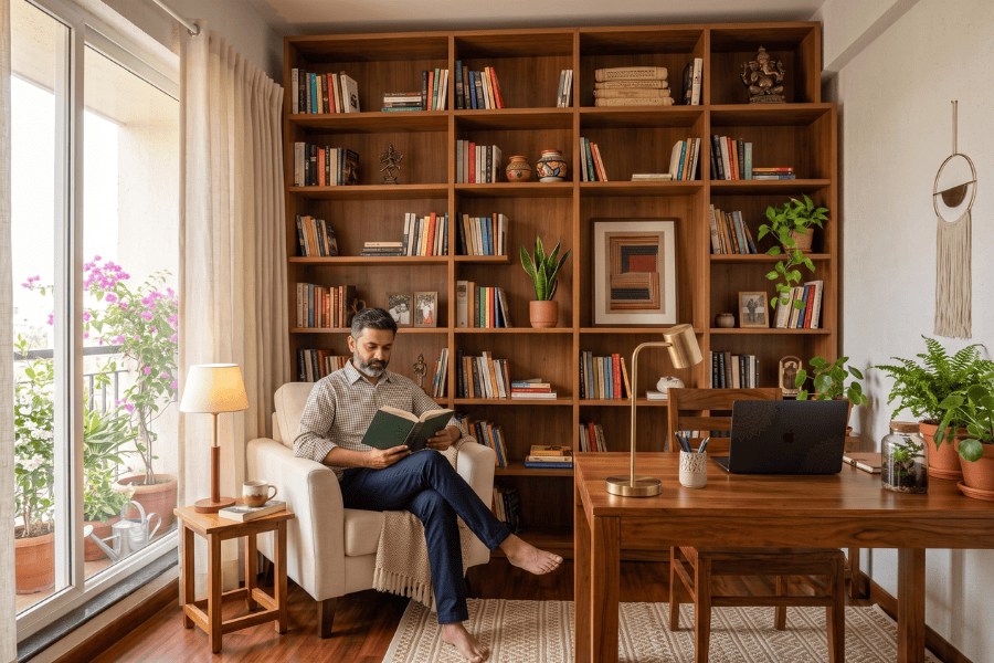
White And Oak For A Timeless Study
White walls with oak or wooden furniture create a classic study room look. It is simple, elegant and practical. This style works especially well for homeowners who prefer long-lasting design choices.
Dark Brown And Off-White For A More Formal Look
If the study room is also used as a home office, this combination can work well. The off-white keeps the room light, while dark brown adds seriousness. Use dark brown in shelves, flooring or furniture rather than as the main wall colour.
Other Good Combinations To Consider
Here are three more combinations that work well:
- Blue and white for calm and focus
- Yellow and grey for brightness with balance
- Green and beige for a natural grounded feel
Matching Tile Designs With Study Room Colours
Tiles are often overlooked, but they affect how a study room feels. The wrong tile can make the space look cold or busy. The right tile can support the wall colour and keep the room balanced. For most study rooms, subtle tiles are best.
Tile Ideas That Work Well
- Matte neutral tiles for a soft finish
- Wood-finish tiles for warmth
- Light stone-look tiles for a clean feel
- Simple geometric patterns in small doses
Tile Finishes To Consider
| Finish | Why It Works |
|---|---|
| Matte | Soft look, less glare and better for focus |
| Satin | Easy to maintain and not too shiny |
| Wood Finish | Adds warmth and suits white, cream and green palettes |
| Light Stone Finish | Keeps the room clean and understated |
Avoid overly glossy tiles in study rooms. Too much shine can create glare, especially under tube lights or near windows.
Décor Ideas That Support A Study Room
A good wall colour helps, but décor also matters. The room should feel supportive, not crowded. Vastu-friendly study room décor should be simple and useful.
Vastu Painting For Study Room
Choose paintings or wall art that suggest calmness, learning or progress. Many Vastu practitioners recommend images associated with wisdom, focus or positive movement.
Avoid chaotic, aggressive or sad artwork in a study room.
Practical Décor That Helps
- Simple curtains in light shades
- Wooden furniture with clean lines
- A desk with enough clear surface area
- Soft lighting without harsh glare
- Neat shelves instead of overloaded storage
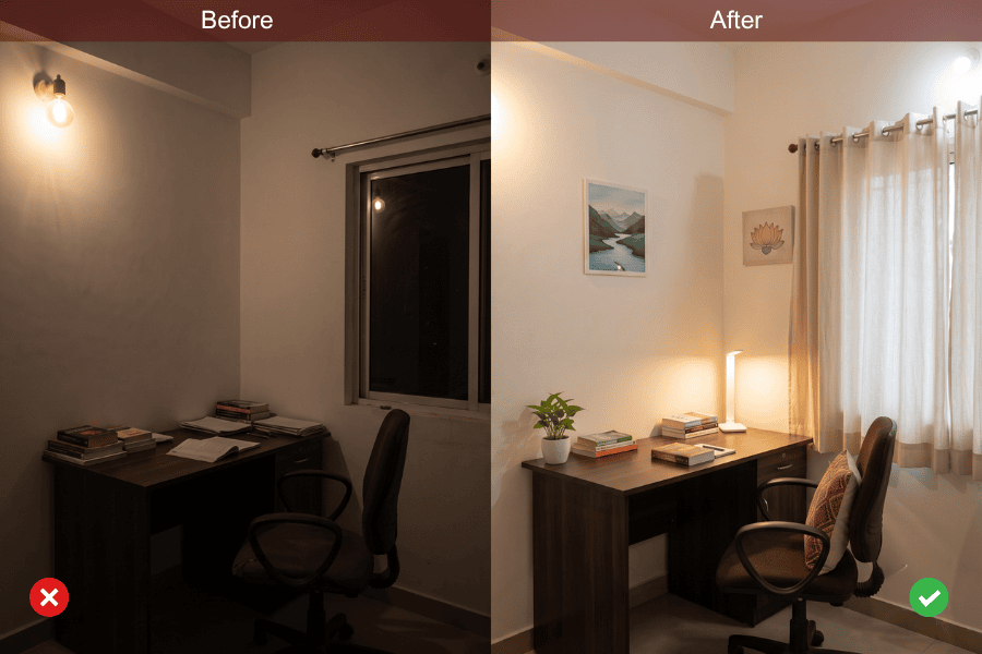
For many families, the problem is not the colour alone. It is the combination of dark wall paint, crowded shelves, poor lighting and too many decorative items. Once these are reduced, the room starts feeling better.
Simple Vastu Remedies For Study Room Doshas
Sometimes a room cannot be repainted immediately. Sometimes the study space is already fixed. In such cases, small remedies can still help.
Practical Remedies You Can Use
- Add lighter curtains or a lighter rug
- Use a cream or white desk lamp shade
- Bring in wooden elements for warmth
- Use a soft green or blue pinboard
- Place calming artwork instead of loud prints
- Declutter the study table and open shelves
If the walls are dark brown or deep grey, even changing the furnishings can reduce heaviness. A white chair cover, lighter table mat or cream storage boxes can make a visible difference.
This is useful in older homes where full renovation is not practical.
Final Thoughts
The best Vastu colour for a study room is one that helps the mind settle. It should make the room feel calm, light and easy to use every day.
For most homes, you do not need anything complicated. Light green, cream, white, beige and pastel blue are usually safe and practical choices. They work well in both modern and traditional Indian homes.
If you are planning a new home, updating one room or setting up a small study corner, start with colour. It is one of the simplest changes you can make, but it often has a strong effect on how the room feels.
If you want expert guidance for your home, Vastu Ananda offers Vastu consultations for plot Vastu, residential Vastu, commercial Vastu, hotel Vastu and office Vastu. They also offer a vastu basic course and vastu advanced course for learners who want to study the subject in more depth.
FAQs
What Is The Best Colour For The Study Room As Per Vastu?
Light green, white, cream, pastel blue and pale yellow are among the best choices. These colours are generally associated with calmness, clarity and better focus.
Which Colour Is Used In The Study Room According To Vastu?
The most commonly used Vastu-friendly colours are light green, white, cream, beige, pastel blue and soft yellow.
Which Colour Is Not Suitable For A Study Room?
Black, neon shades and very dark red are usually not suitable for large surfaces in a study room. They can make the space feel heavy or distracting.
How Many Colours Should A Study Room Have?
In most cases, two or three colours are enough. One main colour, one supporting tone and one small accent usually work best.
Which Colours Should You Avoid In A Study Room?
Avoid very dark, harsh or overly bright shades. These include black, dark red and neon tones.