Have you ever painted a room, stepped back and still felt unsettled?
This happens often. The colour may look attractive, but the room can still feel heavy, dull or restless. In Vastu Shastra (वास्तु शास्त्र), colour is not a small design detail. It influences mood, supports positive energy and shapes how comfortable a residential space feels over time.
That is why many families now check the right colour guidance before choosing wall shades. If you are repainting, moving into a new place or setting up a space for the next stage of life, the wall paint colour should support peace, clarity and ease.
This guide explains the best paint choices through four practical lenses: colour meaning, the five elements, direction and room use. When applied well, the right shades can improve harmony, comfort and even a sense of prosperity.
What Different House Colours Represent
Before choosing paint shades, it helps to understand what each colour stands for. This gives context to any room-by-room or direction-based recommendation.
| House Colours | What They Mean in Vastu |
|---|---|
| White | White brings peace, purity, clarity and openness. It suits spaces that should feel calm, clean and spiritually light. |
| Green | Green represents growth, healing, freshness and balance. It is useful in rooms that need focus and renewal. |
| Yellow | Yellow is linked with warmth, hope, learning and upliftment. It adds positivity without feeling too strong. |
| Blue | Blue stands for calmness and emotional ease. Lighter shades are better than very dark ones in most interiors. |
| Red | Red reflects action, strength and the fire element. It adds energy, but too much can feel intense. |
| Pink | Pink carries warmth, softness and comfort. It is gentler than red and works well in restful rooms. |
In real spaces, these choices are often intuitive. Most people naturally choose soft shades like white, cream or pale yellow for a puja room because they feel quiet and respectful. This is one of the simplest ways vastu colours work in everyday life.
How Colour Links With the Five Elements
In Vaastu, colour is always connected with the five elements, or Panch Mahabhutas (पंच महाभूत): earth, fire, water, air and space.
Earth Element Colours
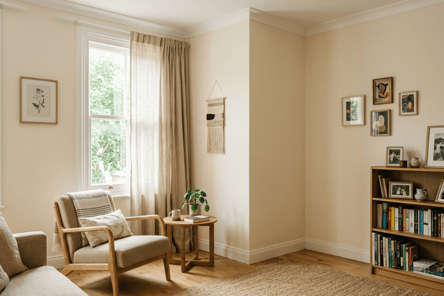
The earth element gives stability, support and grounding. Its shades include beige, cream, sand, muted yellow and light brown. These gentle, earthy tones are especially useful in the South-West.
They work very well in the master bedroom because they create steadiness. Used too heavily in a small dark room, however, they can feel dull.
Fire Element Colours
The fire element supports confidence, action and transformation. Its shades include red, coral, orange, warm peach and even muted terracotta.
These colours work best in the South and South-East, especially in the kitchen. A softer peach or terracotta shade is usually more balanced than a bright red wall.
In bedrooms or prayer areas, too much fire energy can disturb calmness.
Water Element Colours
Water is linked with flow, emotional ease and abundance. Light blue, soft turquoise and aqua shades are common water colours.
These colours suit the North and spaces that need a cooling effect. In the kitchen, though, water shades are usually less suitable because they can weaken the room’s natural fire quality and interrupt Energy flow.
Air Element Colours
Air supports movement, freshness and communication. It is often expressed through light green, white and soft pastel shades.
These colours work well in the East and North-West. They keep the atmosphere light and open without creating too much visual activity.
Space Element Colours
The space element, or Akash (आकाश), represents openness and expansion. White, off-white and very light neutrals support it.
These shades are ideal for puja spaces, meditation corners and small rooms. They often help an older property feel less closed in.
Choosing Paint Colours by Direction
One of the most practical ways to apply these principles is through direction. This is where many people begin when selecting shades.
The right paint should support the direction of the room, not work against it. In many cases, the best approach is not to chase fashionable colors, but to choose shades that suit the character of the space.
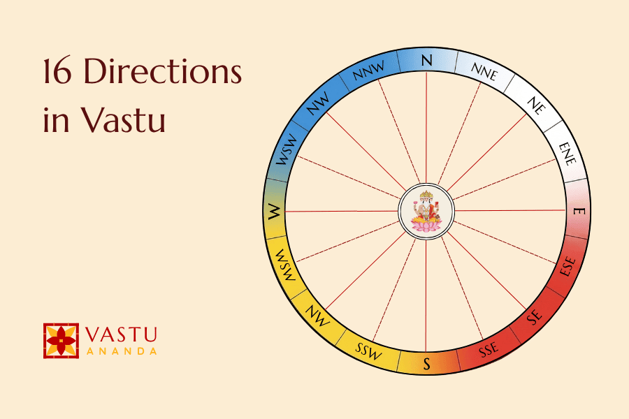
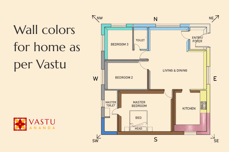
The elements are also reflected through the directional grid. In detailed planning, we work with 16 zones: North, North-North-East, North-East, East-North-East, East, East-South-East, South-East, South-South-East, South, South-South-West, South-West, West-South-West, West, West-North-West, North-West and North-North-West.
This is why vastu colour recommendations are more precise than simply selecting shades by personal taste or current architecture trends. These are not random rules. They come from tested Vastu principles about balance and placement.
Colours for North (उत्तर) and Nearby Zones
The North is associated with growth, flow and opportunities. Light green, soft blue and fresh pastels usually work well here.
North-East (उत्तर पूर्व)
The North-East is one of the most important zones. It should remain calm, light and clear.
White, pale yellow, light blue and gentle green are suitable here. These shades are ideal for a puja room, study room or quiet sitting corner.
Strong red, dark brown and very heavy colours are better avoided here.
North-West (उत्तर पश्चिम)
The North-West benefits from white, cream and other light neutrals. These shades support movement and balance.
They work well in guest spaces, a drawing room or rooms that should feel airy rather than fixed.
Colours for South (दक्षिण) and Nearby Zones
The South carries stronger, warmer energy. Pink, coral, peach and muted red generally work better here than cool blues.
South-East (दक्षिण पूर्व)
The South-East is the fire zone, so it naturally suits the kitchen and, in some layouts, even a nearby dining room. Orange, coral, peach and soft red are more aligned with this direction.
Blue and black are usually avoided here.
South-West (दक्षिण पश्चिम)
The South-West is best with stable earth shades such as cream, beige, taupe and light brown. These colours support grounding and long-term stability.
That is why this zone is often preferred for the master bedroom.
Colours for the West (पश्चिम)
The West can take soft blue, cream-blue combinations and selected earthy neutrals. The aim is to keep the space balanced, not closed.
In many interiors, a softer palette works better here than anything too dark.
Colours for the East (पूर्व)
The East is linked with freshness, clarity and morning light. White, light green and soft beige are good choices.
These shades also bring a quiet sense of vibrancy without feeling loud.
Best Paint Colours for Each Room
Direction matters, but room use matters just as much. Colour should support how the room is used every day.
Living Room Colours That Feel Warm and Welcoming
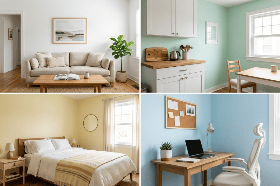
The living room should feel easy to sit in. White, cream, beige, pale yellow and soft green usually work well.
These shades suit spaces used for family time, tea and guests. Harsh red and very dark blue can make the room feel tense.
Bedroom Colours That Support Rest
A bedroom should help the mind slow down. Soft pink, pastel green, light blue, cream and muted earth shades are safer choices.
For older homeowners, especially, calmness matters more than drama. Bright red, sharp orange and very dark shades should usually be avoided.
Kid’s Room Colours That Feel Balanced
A child’s room should support sleep, study and play. Light green, pale yellow, soft blue and white are practical options.
These shades keep the room cheerful without making it overstimulating.
Kitchen Colours That Match the Fire Element
The kitchen is linked with fire. Warm shades like peach, soft orange, yellow, warm white and touches of red work well.
Blue, black and dark grey are generally less suitable.
Puja Room Colours That Feel Calm and Clean
The puja room should remain quiet and light. White, cream, pale yellow and very light orange are the safest choices.
These shades help the room feel spiritually calm and uncluttered.
Home Office Colours That Help You Focus
A home office should support concentration. Green, white, light blue and soft beige are useful.
In such spaces, colour should reduce mental strain rather than add to it.
Bathroom Colours That Feel Fresh and Light
The bathroom should feel clean, open and easy to maintain. White, pale blue, light grey and very soft pastel shades usually work best.
Very dark colours can make a small bathroom feel closed and heavy. A lighter scheme is usually the safer choice.
Main Gate and Exterior Colours That Set the Tone
The exterior and main gate create the first impression. North-facing entrances often suit white, green and light blue. South-facing spaces can take coral or earthy red more comfortably.
Soft shades on exterior walls usually age better and look less harsh over time.
People also ask how to open the main door correctly according to traditional guidance. Along with colour, the entrance should feel unobstructed, clean and easy to open. That helps the space feel welcoming from the first step.
A Few Extra Tips Before You Finalise Paint
Use strong shades as accents rather than across every wall.
Always test the shade in natural light before finalising it.
If direction and room use seem to conflict, room function should usually guide the final decision.
Also think about the full interior as one connected scheme. The colours do not need to match everywhere, but they should not clash from one room to the next.
Final Thoughts
Choosing the right paint is not only about appearance. It is about how a space feels every day.
The best colour depends on direction, room use and the nature of that area. White brings peace. Green supports growth. Yellow uplifts. Blue calms. Red energises. Pink softens.
If you are making changes, start with the rooms you use most. Thoughtful updates usually work better than dramatic ones.
If you would like expert guidance, Vastu Ananda offers consultations for plot vastu, residential vastu, commercial vastu, hotel vastu and office vastu. Book your appointment now!