
A room can look complete and still feel wrong. Often, the problem is not the furniture or paint. It is the curtains.
Curtain colour affects light, mood, and the way a living space feels throughout the day. In Vastu Shastra, curtains also influence the energy flow because they cover windows, doors, and open sections of a room.
This makes curtain selection important in homes, offices, and shops. The right colour can make a bedroom feel calmer, a living room feel lighter, or a workspace feel more stable and focused.
In this guide, we cover Vastu tips for the best curtain colours, direction-wise colour choices, room-wise suggestions, curtain colours for a home office, what to avoid, and simple remedies.
Why Curtain Colour Matters in Vastu
Curtains sit at openings where light and energy enter. Their colour and fabric affect whether a room feels open, calm, bright, heavy, or closed.
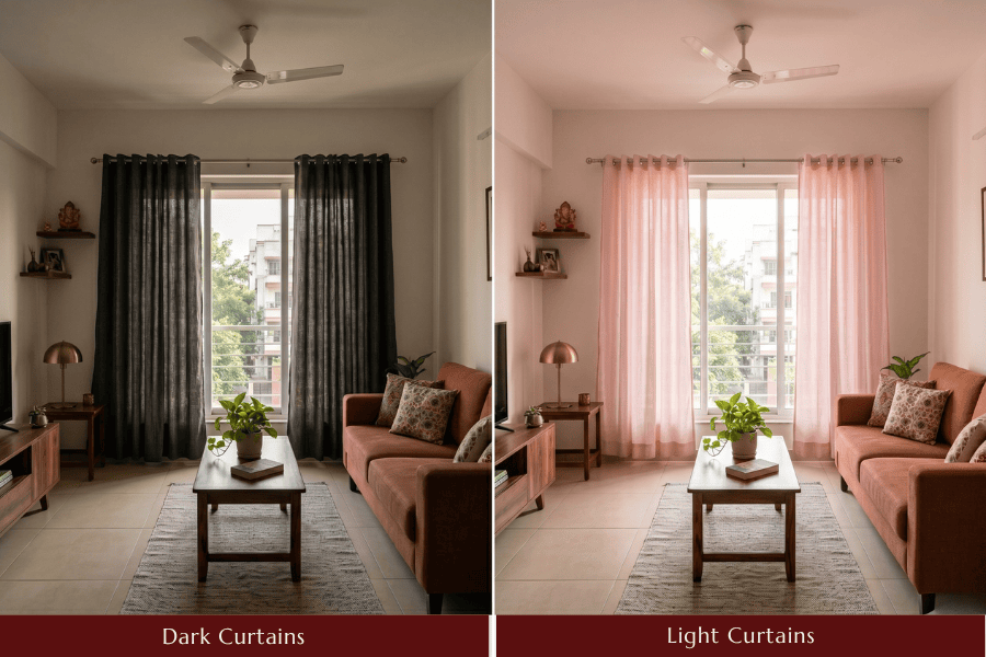
Light and balanced colours usually improve the feel of a room. Very dark or harsh colours can make it feel dull or tense.
Soft colours such as blue, green, cream, and white create calm. Yellow and soft orange add warmth. Dark and muddy shades can make a room feel heavy, especially if there is little natural light. Blues and greens are commonly associated with peace, while stronger warm tones feel more stimulating.
Relaxing curtain colours include light blue, soft green, beige, cream, and white curtains. Happy curtain colours include yellow, peach, soft orange, and gentle pink. Auspicious curtain colours in Vastu usually include white, cream, light yellow, light green, and soft blue.
Best Curtain Colours as per Vastu
- Yellow adds brightness, clarity, and warmth. It brings positivity in East-facing rooms, study rooms, and family spaces.
- Blue creates a cool and peaceful feel. Light blue suits bedrooms, study rooms, and North-facing spaces.
- Green supports balance and freshness. It works well in North and East-facing rooms, children’s rooms, and study areas.
- Soft orange and pink bring warmth and comfort. These shades suit guest rooms, dining spaces, and selected South-East-facing rooms.
- Beige, cream and white are among the safest curtain colours in Vastu. They make rooms feel light, clean, and stable.
- Red, purple, brown, grey and gold curtains colours need careful use. Red curtains symbolise strength. Brown is grounding. Grey works best in lighter tones and brings in positive energies. Gold adds warmth when used softly.
- Pastels and neutrals are easy to use in most homes. Shades such as ivory, sand, pale peach, and off-white help create a soft and balanced look.
Curtain Colours by Direction as per Vastu
In Vastu, direction matters as much as colour. Each direction has a different quality and element.
The full 16-zone directional grid includes:
- North (उत्तर)
- North-North-East
- North-East (उत्तर पूर्व)
- East-North-East
- East (पूर्व)
- East-South-East
- South-East (दक्षिण पूर्व)
- South-South-East
- South (दक्षिण)
- South-South-West
- South-West (दक्षिण पश्चिम)
- West-South-West
- West (पश्चिम)
- West-North-West
- North-West (उत्तर पश्चिम)
- North-North-West
For curtain selection, most people follow the main directions and corner zones.
| Direction | Best Curtain Colours | Effect |
|---|---|---|
| North (उत्तर) | Light blue, green, white | Flow, freshness, prosperity |
| East (पूर्व) | Pale yellow, white, light green | Light, clarity, growth |
| South (दक्षिण) | Beige, earthy tones, muted red | Strength, stability |
| West (पश्चिम) | Cream, white, light grey, soft blue | Balance, support |
Room-Wise Curtain Colours as per Vastu
Cream, beige, light yellow, soft green, and off-white work well in living rooms. These shades make the space feel open and welcoming.
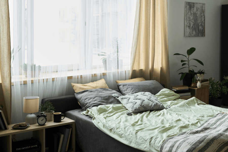
Light blue, soft green, cream, beige, and dusty pink are good as master bedroom curtain colours. They create a calm and private feel. Blackout curtains can work in bedrooms if the colour remains soft and suitable.
Light yellow, green, sky blue, and soft peach are good choices. These shades feel cheerful without being too bright.
Green, light blue, cream, and soft yellow help support focus and steadiness. This is ideal for study rooms.
Cream, beige, white, and light grey keep the guest room neutral and comfortable as per Vastu principles.
Soft yellow, light orange, cream, and warm neutrals suit the dining room well.
Peach, cream, light yellow, and soft orange are suitable for kitchens, especially where the Fire element is active.
White, light blue, pale grey, and cream help bathrooms feel clean and fresh.
Curtain Colours for Office, Shop, and Commercial Spaces
Curtain colours matter in workspaces too. In offices and shops, curtains affect focus, customer comfort, and the overall feel of the space.
For offices, choose colours that support clarity and steady work. Light blue, beige, cream, white, and soft grey are usually the best options. These colours help the space feel organised and calm.
For cabins or meeting rooms, beige, cream, muted green, and light brown work well. They create a grounded and professional feel without looking dull.
For shops, the colour of the curtain should depend on the type of business. White, cream, light yellow, and soft gold are useful in spaces that need a bright and welcoming atmosphere. In boutiques or premium showrooms, soft beige, ivory, and warm neutrals often work better than loud shades.
For commercial spaces, avoid very dark curtains, heavy prints, and harsh contrasts. These can make the space feel closed and reduce the sense of openness that customers and staff need.
If the commercial unit is direction-sensitive, follow the same Vastu direction rules used for homes. North-facing offices benefit from lighter shades. South-West-facing cabins benefit from stable neutrals. South-East-facing work areas can handle controlled warm tones.
Use light blue, cream, white, beige, and soft grey in the office or home office. These colours support focus, stability, and a professional environment.
In shops, use white, cream, light yellow, soft gold, and warm neutrals. These colours help the space feel bright, clean, and inviting. Direction-based colours, along with neutral shades that support clarity and balance, work best in commercial spaces.
How To Choose Curtains as per Vastu
The five elements in Vastu are Water, Fire, Earth, Air and Space.
Water works with blue and white. Fire works with orange, pink, peach, and controlled red. Earth works with beige, brown, and mustard. Air works with white and light grey. Space works with light, open-looking shades.
Here’s a guide on curtain colors and placement according to the five elements in Vastu Shastra:
| Zone | Element | Best Curtain Colours |
|---|---|---|
| North-East (उत्तर पूर्व / ईशान कोण) | Water (जल) | White, cream, pale yellow, light blue |
| North-West (उत्तर पश्चिम / वायव्य कोण) | Air (वायु) | White, light grey, cream, soft blue |
| South-East (दक्षिण पूर्व / अग्नि कोण) | Fire (अग्नि) | Peach, pink, light orange |
| South-West (दक्षिण पश्चिम / नैऋत्य कोण) | Earth (पृथ्वी) | Beige, brown, mustard, earthy neutrals |
Cotton, linen, and other breathable fabrics usually work better than heavy and stiff materials. They allow more softness and movement in the room.
Choose soft florals, light geometric motifs, stripes, or simple nature-inspired prints, as these are auspicious in Vastu principles. Avoid chaotic or gloomy designs.
Do not choose curtains only to match the wall colour. Choose them based on direction, room use, and the kind of energy the room needs.
Curtain Placement Tips as per Vastu
Curtains work well on windows, balcony doors, glass dividers, and selected open areas where privacy or energy control is needed.
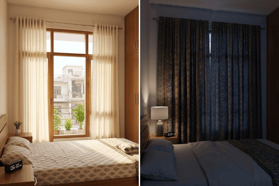
Keep curtains open during the day in North and East-facing spaces where sunlight and movement are beneficial. Close them at night or when privacy is needed. Do not keep important light zones covered all day.
Curtains can also be used as soft dividers in multi-use spaces. Use light and calm shades so the house still feels open.
Curtains soften glare, add privacy and control exposure. They help balance a room that feels too open, too sharp, or too heavy. Blackout curtains are also suitable for bedrooms according to Vastu. Window blinds also work if they are simple, clean, and in soft colours.
Curtain Colours To Avoid as per Vastu
Very dark black, muddy brown, and harsh shades can make a room feel heavy and closed. Strong contrasts, such as black and red can also create visual stress and should be limited.
Bulky curtains can make even a good room feel shut in. This is a common problem in flats with limited daylight.
Avoid very chaotic patterns or gloomy curtain prints. A common mistake is choosing a trendy colour without thinking about direction or room use. This can bring in unwanted clutter or negative energies into the home.
Dirty, faded, torn, or badly hung curtains weaken the feel of the room. Curtains should be clean, easy to move, and suitable for the season.
Seasonal and Remedial Use of Curtain Colours in Vastu Shastra
Curtains are easy to change, which makes them useful as remedies, especially in rented homes.
In the summer, use white, cream, pale blue, and soft green. During the monsoon, warm neutrals and gentle yellow help brighten the home. In winter, beige, muted gold, and earthy tones add warmth.
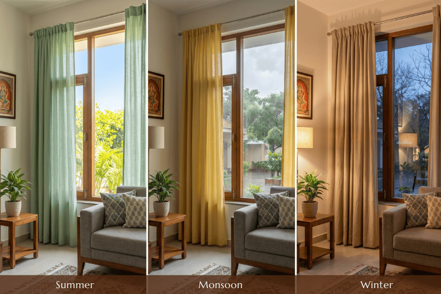
Use white or cream in dark rooms. Use soft peach or pink in weak Southeast facing spaces. Use beige or earthy tones in unstable South-West-facing rooms. Use pale and pure shades in heavy North-East zones.
If you want room-specific guidance for your home, office, or shop, you can book a Vastu consultation with Vastu Ananda for practical advice on curtain colours, placement, and remedies.
Final Thoughts
Curtain colour affects how a space feels every day. In Vastu, it affects comfort, balance, and the way energy settles in the room.
The right curtain colour can improve a home, office, or shop without major changes. With the right direction, fabric, and shade, curtains become a simple but effective Vastu tool.
FAQs
Which Curtain Colour Is Best as per Vastu?
White, cream, beige, light yellow, soft green, and light blue are among the best curtain colours in Vastu.
Which Curtain Colour Is Best for a Bedroom?
Light blue, cream, beige, soft green, and dusty pink work well in bedrooms.
Which Curtain Colours Should Be Avoided?
Very dark, harsh, heavily contrasting, and gloomy curtain colours should usually be avoided.
Are Blackout Curtains Good as per Vastu?
Yes, blackout curtains are suitable for bedrooms when used properly and in the right colour.
Can Curtains Be Used as Vastu Remedies?
Yes. Curtain colours can help correct room imbalance and improve the feel of the space.